Reversing some truths behind two images
by Martine Joly (MARE)
(14 March 1998)Reality cracking
 Courtesy of fravia's page
of reverse engineeringCourtesy of fravia's page
of reverse engineering
Courtesy of fravia's page
of reverse engineeringCourtesy of fravia's page
of reverse engineeringI'm sorry, but after having searched the Web everywhere I could not find any ready-scanned image of the advertisement that I will analyze here. You'll have to content yourselves with the badly scanned image I have made myself, that is until some pious soul will find and send me (or fravia+) a better scanned image of this advertisement.Rhetoric of advertisement, a "Marlboro Classic" advertisement analyzed By Martine Joly (MARE) 14 March 1998
 |  |
 | |
Let's go straight to the point: This Advertisement
took a double page of the Magazine "Nouvel Observateur" on 17 October 1991 (I wrote a
paper on this two years later).
This French Magazine has an intello-leftist readership: middle class vaguely left
oriented French managers and similar people. The fact that it has been published in
OCTOBER is important, seen the contents of the product promoted.
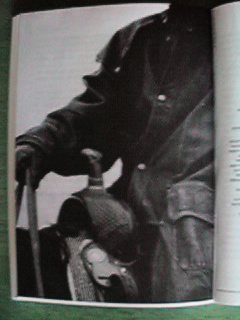
The right page carries on the top third a small picture (8cm * 10 cm), centred, that represents a snow-filled landscape: some wooden barriers that seem to delimit a corral, on a background of snow and trees without leaves. There is no sky at all in this image.
There is a text above this smaller image: "L'hiver est proche, nos points de vente aussi" (in English: "Neither winter nor our selling points are far away". Below the image there is a complete list of French addresses divided by categories: "Boutiques exclusives", "Corners" and "Points de vente". The town and city names are underlined. This list of names and addresses fills almost the whole page.
Below, always on the right page, centred and in big bold characters, there is the Product logo: "Marlboro Classic" and below this, smaller: "Fits the man".
A very small reference sends you to a tiny translation on the right side: "Habille les hommes" which finds, on the left side of the right page, a counterpart: "Un produit de Marlboro Leisure Wear"
The whole visual message contains THREE different messages: a plastic message, an iconic message and a linguistic message. We will analyse all three messages, and then see how they interact.
The plastic message
The frame
Each image has physical limits, that are more or less indicated by a frame, according to the various �poques and styles. The frame is often seen has a restriction, and that's the reason that you will often see tricks in order to "abolish" or let people "forget" it, from internal re-framing to the simple discarding of the frame.
On the left page the image does not have any frame, it looks "cut", interrupted by the page margins, therefore we cannot see the rest of it "because the page is too small".
This trick: amalgamating the frame (or better: the frame-limits) with the marges of the support (here the left page of the magazine) has particular consequences on the imagination of the spectator. In fact this cut, whose responsibility seems to lay more on the dimensions of the support than on the choice of the image, pushes the spectator to RECONSTRUCT in his imagination what he does not see in the visual field of the representation, but that must exist to complete the image snippet he is seeing: the "outside".
The lack of a frame on the left page (where the reading begins, never forget this!) creates a "centrifugal" image with an imaginary complementary construction. This kind of approach references implicitly the universe of cinema, that has so often used this kind of tricks.
The white space on the LEFT page, on the contrary, is the frame for the small picture, that finds place like a small window inside the upper third of the page. Here the 'thick' frame incorporates, on the contrary, the visual representation, and starts a process of "centripetal" reading that invites the spectator to "get inside" the fictive depth, like a landscape painting. This kind of approach references painting traditions, not the universe of cinema.
The framing
Understand the difference between framing and frame. The frame is the LIMIT of the visual representation, the framing is the size of the image, the result of the distance between object in the picture and objective.
The two different framing on the two pages are in total opposition. A vertical and very NEAR framing on the left side gives you the impression of being really next to the subject; the horizontal, large framing on the right page gives you on the contrary the impression of being far far away. Note how the two framing propose at the same time a comparative reversing of the relative proportions: what is SMALL (the blazer) acts VERY BIG and what is BIG (nature, landscape) acts VERY SMALL.
Choice of the Objective and picture angle
The choice of these two elements is VERY IMPORTANT, because it strengthens or eliminates the impression of reality due to the photographic support (Photographic pictures are NOT drawings, they should depict 'reality').
In the left image the angle is from the perspective of a person standing on his feet in the proximity of another riding a horse, who gains therefore height and Strength. In the second image, on the right page, on the contrary, you have an angle 'from above' and get the impression that you 'dominate' the landscape.
Note how on the left image they did choose a long objective (see the little 'flou' effects?). The opposition between these 'flou' zones, behind and below, and the clear unclouded blazer and horn cap brings automatically your eyes on some elements of this pictures against others, and decides in this way the privileged zones of attention of this advertisement. These are exactly the points that you need to individuate in order to understand and reverse the 'hidden' meanings of this image. Even the lack of depth is a trick: it transforms a place in a "nowhere place", and therefore an "everywhere place" as well.
Composition and paging
The composition is the intern geography of a visual message, one of the
most important plastic tools of the advertisers. Composition plays a fundamental
role in the hierarchysation of your vision, orienting the reading of the image
that you will perform. In ANY image (painting, film-plan, drawing whatever) the
construction is fundamental and may respect, or rebuke a series of conventions
that have been developed in different �poques, periods and styles. Yet eyes
always follow THE PATH THAT HAS BEEN PREPARED INSIDE THE IMAGE. The existence
of reading patterns is well known, the most obvious ones are the left to right
Euroamerican one, the Top to bottom Sino-Japanese one, and the right to left
Arabic one. In advertisement there are four possibilities:
1) the "lines of power" construction: these imaginary lines point towards a part
of the advertisement that works as a fulcrum. Your vision is "pulled" towards the
strategically placed location of the product name.
2) The axial construction: the product is placed exactly on the axis of your vision, generally in the exact middle of the advertisement.
3) The "in depth" construction: the product is integrated in a perspective placed scene and has the first plan inside this painstakingly constructed scene.
4) The sequential construction: your vision follows the advertisement and then 'falls" at the end of the path, on the product, that in a left-right Euroamerican orientation of the reading will be mostly on the bottom right of the advertisement. The most typical model of sequential construction is the "Z" form: you begin on the top left side, something happens that brings your vision to the top right, then something sends you on the bottom left and read a small text that runs towards the bottom right, with the representation of the product or of the product logo or of the product name.
These constructions correspond to different strategies: if you throw on the market a new product you will try to use the axial construction, where the product monopolises the image and throws its colours and lights towards you. If you are advertising a well known and already existing product you will use targeted and in depth constructions. If you want to attribute to the product qualities that do not exists (the most interesting reversing targets) you will use a sequential construction that shifts during the reading the qualities of the advertisement (luxury, nature, see, naked women, whatever) onto the product. This, being the most vicious advertisement technique, has been forbidden in Europe for cigarettes. As we will see, Marlboro has found a way around it.
Let's go back to our image and notice its sequential construction, from left to right, falling then onto the Marlboro logo, below, on the right page. Each page has its own logic:
On the left side the oblique slope of the mass carries your vision from the most luminous point of the whole advertisement, the saddle horn, which has been placed in axial position, in a slope towards the top right side of the left page, where you will be able to 'pass' to the right page and read the verbal comment, then you will fall vertically from the top to the bottom of the right page and land on the product name. See how 'dynamic' is the sequential construction as well: in our society an oblique line from bottom left to top right "/", is often associated with dynamic, energy, progress, hope and so on, while the contrary, an oblique descending towards right "\" is more connected with falling, regression, destruction. See also how on the right page the descending reading is VERTICAL and not OBLIQUE, avoiding the 'negative' associations and favouring "equilibrium" and "straightness".
FORMS
Form interpretation is basically anthropological and cultural. Let's have a look at our target: once more we notice a system of oppositions: left we have SOFT forms, that are organised as a mass, right we have a system of LINES, slim and vertical, at times underlined horizontally. These lines recall the lines inside the small picture. The whole right page is composed of small thin lines on a white background, looks like a very slow and 'cosy' snowfall. At the bottom of the right page the dark mass of the typographical characters echoes visually the soft mass of the left page where the cylindrical vertical form negates all 'softness'.
COLOURS AND LIGHT
The colours are the same in both pictures: brown, light grey, silver, white. The typographical characters are black on a white background. WHITE: colour of the COLD, of SNOW, of NORTH (and in the Western world, of purity, chastity, innocence, hygiene, simplicity, peace, wise, old, aristocracy, monarchy and godness as well). GREY, colour of heavy sky and metal. Black and white as contrary of the colours, BROWN for earth, tree- rinds, leather, fur. These evident associations are in our target even more underlined by the iconic signs themselves. The warmness of the browns fights here against the coldness of the greys, silvers and white.
Light is DIFFUSE in both pictures. The winter sky does not have shadows nor depth. This kind of light is used to diminish the reality of images, since you loose space parameters, loose depth, get more quiet colours. It's a trick to block for the spectator any possibility of time-reference. This pushes even more the imprecise character of the place and time of the representation. This helps once more to generalise the representation.
Note also how the TEXTURE differs between the two pictures: Left there is some "granularity" and a supposed "thickness", while the picture on the right is smooth and "glaced", which underlines the character of coldness and distance of this image. So we have a TACTILE texture on the left and a VISUAL texture on the right.
Analysing the relation between the two pages we find therefore not so much an antithesis but an oxymoron, a rhetorical figure ("a combination for epigrammatic effect of contradictory or incongruous words" "Make haste slowly") that produces -putting next to each other two opposed terms- a global signification which is somehow "tamed" and enriched by the opposed values of its two elements. As Master +ORC wrote: A good knowledge of ancient rhetoric is a powerful weapon indeed when you need to reverse the world around you... "better than kung-fu" to defend yourself in the virtual world of images, messages and subliminal conditioning of to-day.
ICONIC OF THE MESSAGE
We already saw some of the iconic figurative signs reading the verbal message. Clearly, in this kind of target, every single element has ANOTHER meaning, different from the 'obvious' one.
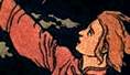
On the left page we have recognised a leather blazer, an arm and a gloved hand holding the reins of an unseen horse. We also have a saddle horn and a part of the neck of the animal.
On the right page we have a snowed landscape, with the barriers of an empty corral.
Here we have a synecdochical representation (or metonymical) we see actually only PARTS of elements that are there to suggest a WHOLE by contiguity, like as the lack of a frame pushed us to reconstruct the missing rest of the image. Here is the significant chain:
ICONIC			FIRST LEVEL	SECOND LEVEL

Part of a blazer	blazer		choice of clothes
					Man clothes

saddle horn		saddle		horse-riding, nature
					virility

mane hairs		horse neck	horse	far-west

soft leather		natural product	warmth, sensuality
					resistance, protection

leather glove,		man hand	Chill, comfort	Toughness
hand					strength	Equilibrium
"soft wrist" 				calm, flexibility
attitude

saddle horn		rest point	strength	phallic virility
vertical, hard	saddle			physical capability

reins			horse		nature, dominion	far west

snowed landscape			Chill, hard natural reality

empty corral		far west	Marlboro cigarettes
			cow boy moving
Of course you may depict differently the various relations, yet you will always land grossomodo on the same results. As you can see, even if you only see a limited amount of circumstances, these elements are more than enough to denote a series of qualities that are attributed to an imaginary man, solid and sport-oriented, with his equilibrium and his comfortable attitude, that gradually will be identified with the stereotyped cow-boy image that has been repeated and vulgarised in the last years by Marlboro for its Cigarettes.
The attitude of the model
In advertisement, typically, models can
either 1) "look you straight in the eyes", giving you the impression of having an interpersonal relation with you, mostly with an "I" and "You" colloquial attitude.
Or 2) look somewhere else, and invite you to look to a third party or personage or event as well.
In the first case you need to speak with somebody, you need to obey to somebody, in the second case you wish to imitate and get some of the qualities of the model. I'll leave to my readers the sad task to understand the relevant implications of both approaches :--)
Here we don't even have the FACE of the model, yet his arm and hand suggest quite a lot. Not only are we missing his face, the whole head has been cut off. The 'impossible' and provocative effect of this decapitation, that could differ too much from the 'usual' advertisement horizon of the spectator, where faces play a preponderant role, is in our target diminished by a series of complementary aspects.
- The lack of a frame stimulates -as we have seen- the spectator to reconstruct the missing face (as well as the rest of the body, of the horse, of the landscape...).
- The fact that you concentrate your regard on the chest, and on the protective curve of the arm gives you more the impression of security and comfort that the impression of watching a body cut ion pieces (as you are actually doing).
- The absence of a precise physiognomy allows anyone to give to the model HIS preferred physiognomy, among others his own one :--)
The absence of the face denotes the most important rhetorical figure of this advertisement target: the ellipsis (from the greek word elleipsis: omission). The ellipsis is a very important rhetorical figure in all form of advertisement and subliminal conditioning (therefore loved and used by politicians, PR-men and crooks alike): it plays on the non-said, on the non-showed. Instead of developing an argument through its clean-cut, explicit argumentations, the ellipsis plays on the 'knowledges' that the reader/spectator already has, and creates a sort of complicity between initiated (+ORC himself uses it throughout his tutorial :--)
Here your already present knowledge NOT ONLY reconstructs the missing face of the cow-boy, but GIVES HIM THE ABSENT CHARACTER OF THE MARLBORO COW-BOY lui-m�me. Through a series of publicity (quite dirty) tricks, Marlboro has passed its cow-boy symbology from cigarettes to fire-lighters and then to clothes. This diversification does not block the 'recognising' of the cigarettes product. This elliptical understanding gives you a sensation of complicity, the pleasure of the connivance, a new transgression that cannot be punished: nothing has been REALLY said, nothing has been REALLY shown.. there is nothing to say.
The ellipsis plays in our target another role: the advertisement gains a 'temporal' reserve: the corral on the right page is empty. It was full of horses at a given time before, it will be full again in the future: we are therefore in a transitory moment, between the last travel and the next one.
THE LINGUISTIC MESSAGE
Images (as we have seen here) carry a LOT of messages. The text is therefore very important to eliminate part of the polysemantic variants offered by the images.
You find here (on the right page, at the bottom) "Marlboro Classic". This is reassuring, clearly, if the notice would have been "Paris 1912", for instance, the
spectator would have been taken by surprise (another not so fancy technique).
Here we have a triple linguistic message: a legend: "L'hiver est proche, nos points de vente aussi"; a list of addresses, the product "Marlboro classic" and an 'explanation': "Fits the man", with French translation.
Before analysing the "contents", let's have a look at the very important typographical aspect of the words, i.e. choice of fonts, colours and disposition on the page. As you can see you have bold and thick characters for the logo, uppercase slim for the legend and little caps for the addresses. The legend "L'hiver est proche, nos points de vente aussi" (this target has been published in October, as we have seen) corresponds to the time reality of the moment, and works as ANCHOR and as CONNECTOR.
As ANCHOR since it defines winter, the cold season, snow as a privileged reading level for the whole target among all other elements that we have seen. As CONNECTOR for the rest of the message. In fact the vicinity in time of a particular season (or whatever else) cannot be exprimed graphically... that's the reason you still have in films and cartoons the small "one month later" written advices... how should the spectator or reader, anchored in his subjective real time else follow the virtual imposed film or cartoon time?
Here there is as well a play between the temporal proxility of the winter season and the spatial proximity of the shops where you (should) buy these clothes. Note also how they use a "nos". This "we" create a relation with an implicit "vous"/"you" that could have been represented visually, but that is impossible in this target seen that there is no "face" and therefore the interpersonal involvment is demandated to the text. "Points de vente" is also a notion that the target prefers NOT to represent visually (seen that it would underline the 'purpose' of the whole operation) and that has been graphically eliminated choosing instead other images and associations that bring more positive imagination stimuli with them.
Once more some rhetoric (we will never insist enough on its importance): the text uses here a variant of the ellipsis: the zeugma from greek zeugnumi: yoke. A phrase in which one word modifies or governs two or more not connected in meaning: "Miss Bolo went straight home in a flood of tears and a sedan chair" (Dickens, Pickwick, XXXV). usually the zeugma is used to give as granted, in a period, some terms used in a previous sentence. The correct French phrase would have been: "L'hiver est proche, nos points de vente sont proches aussi". but here the quality of one part of the period are passed onto the other part: season and time "go over" to the shops where you can buy; Winter=shop; time and space are mixed in one ineluttable necessity: winter comes (true) therefore I must get some warm Marlboro clothes (or either at least smoke a Marlboro cigarette).
The long list of addresses gives the impression that Marlboro classic is everywhere, universal, like the use of an english part 'Fits the man' on a French magazine underlines as well. Not the use of "the"... fits the whole human race.
SYNTHESE
The reader that has followed my text until this point can easily perform
a synthese of this target's real messages. I'll leave this as an useful
exercise to you. I will just finish, after all these words of mine, repeating
the old (true) proverb: a good image is worth a lot of text pages...
Reverse well! (and, yes, I know that my English is far from perfect... anybody wants to proof-read and correct this? Please do).
(c) 1998 Martine Joly All rights reversed